Omni App, 2018
Click image to open Adobe XD prototype
This app was created in response to a design challenge by Microsoft to solve for an exclusion in a deskless workplace. We decided to focus on the difficulties that young adults with ASD face in getting a job and working in a tech workplace, and to create a product that assists them with these difficulties. The result of this challenge is an app that acts as a job assistant/coach.
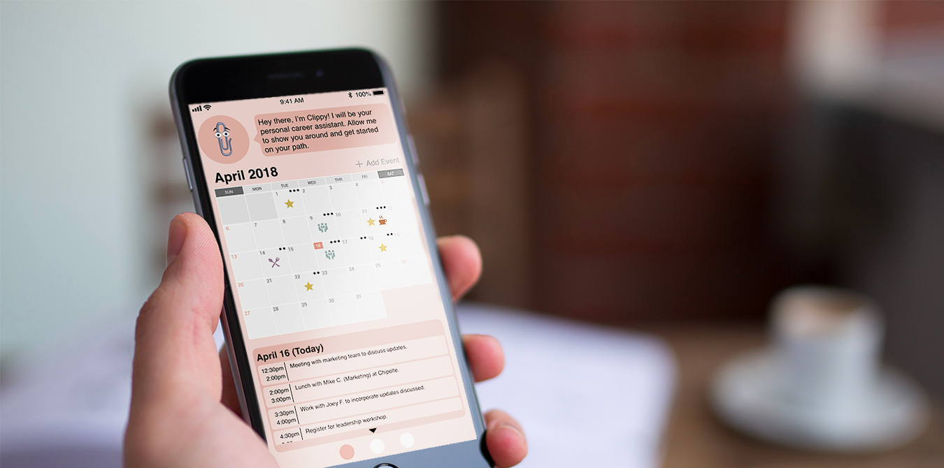
The app's main features are a job application hub, a fully integrated calendar, a communications page, and an A.I. assistant. All of these features work to combine the different aspects of the job search and application process with the aspects of having a job in order to make it easy to keep track of everything in one place. Although the app is designed to assist people with ASD, it is also using principles of Inclusive Design in order to assist anyone else who might need the features of the app.
Research
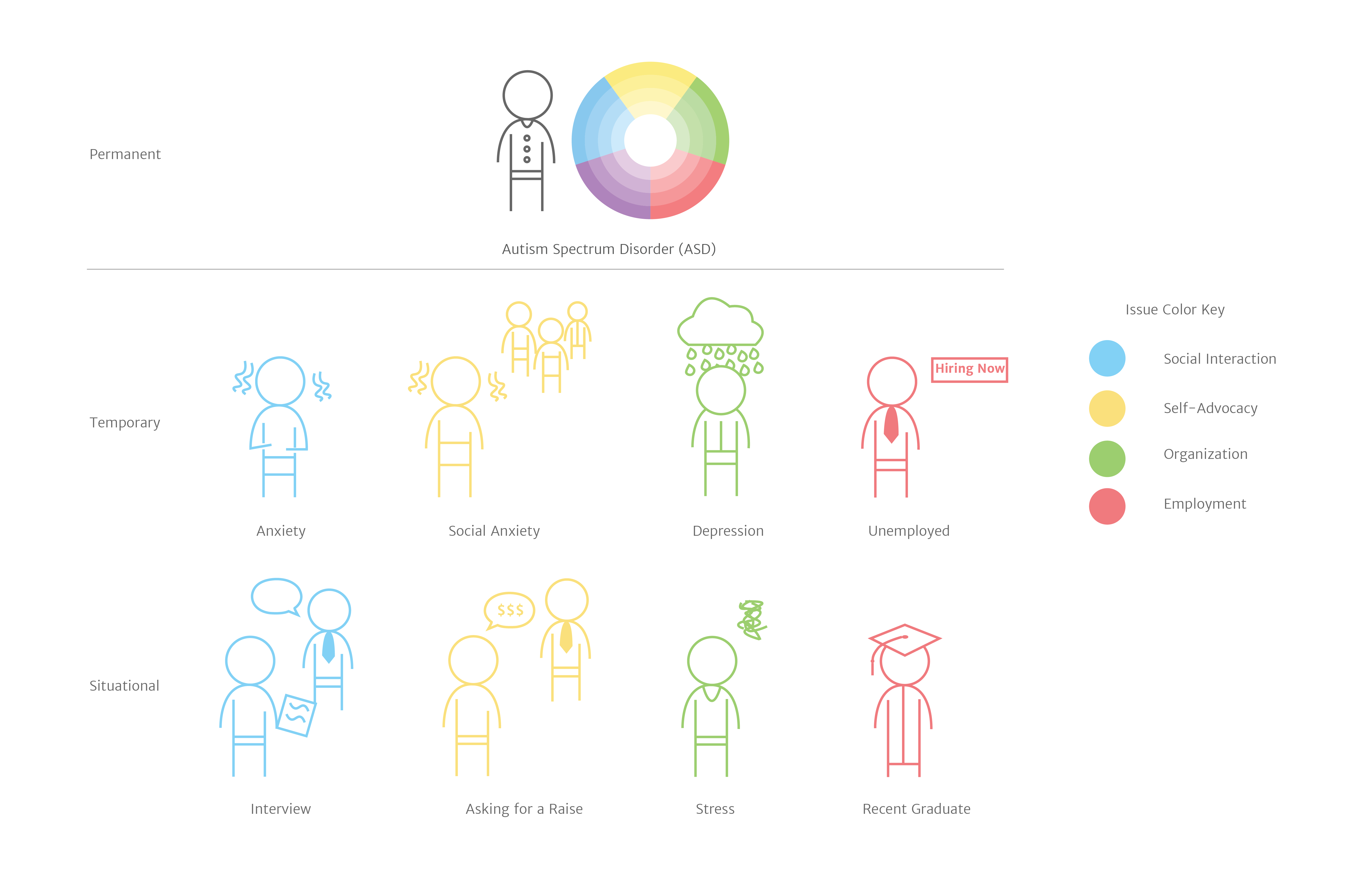
We started the project by doing preliminary research. We mainly focused on understanding more about autism, as well as the issues that people with ASD face in the workplace. From research, we understood more about the spectrum, and how living with ASD is not the same for everyone. We also learned that 38% of people with ASD work in the tech field, and that was one of the primary reasons for why we decided to design for a tech workplace. Another thing we learned from doing research is that people with ASD often struggle with social situations and recognizing emotions and subtexts in conversation. This was a driving force behind creating an AI assistant to help with conversations. Lastly, we researched existing solutions and potential solutions for our particular focus. We found out about a product called "Empower Me" that works on the Google Glass and works to assist people with ASD through teaching them different skills. We combined these different aspects of research to create our own app.
Brainstorming
During our initial brainstorming sessions, we focused on figuring out what disability we wanted to work with, what type of workplace we wanted to solve for, and the form that our solution should take. Initially, we decided that we wanted to help people in the service industry who also have ASD. However, we switched to designing for a tech workplace for two reasons: we realized it would be difficult to get access to people in the service industry, and because our research showed that there 38% percent of adults with ASD work in the tech industry.
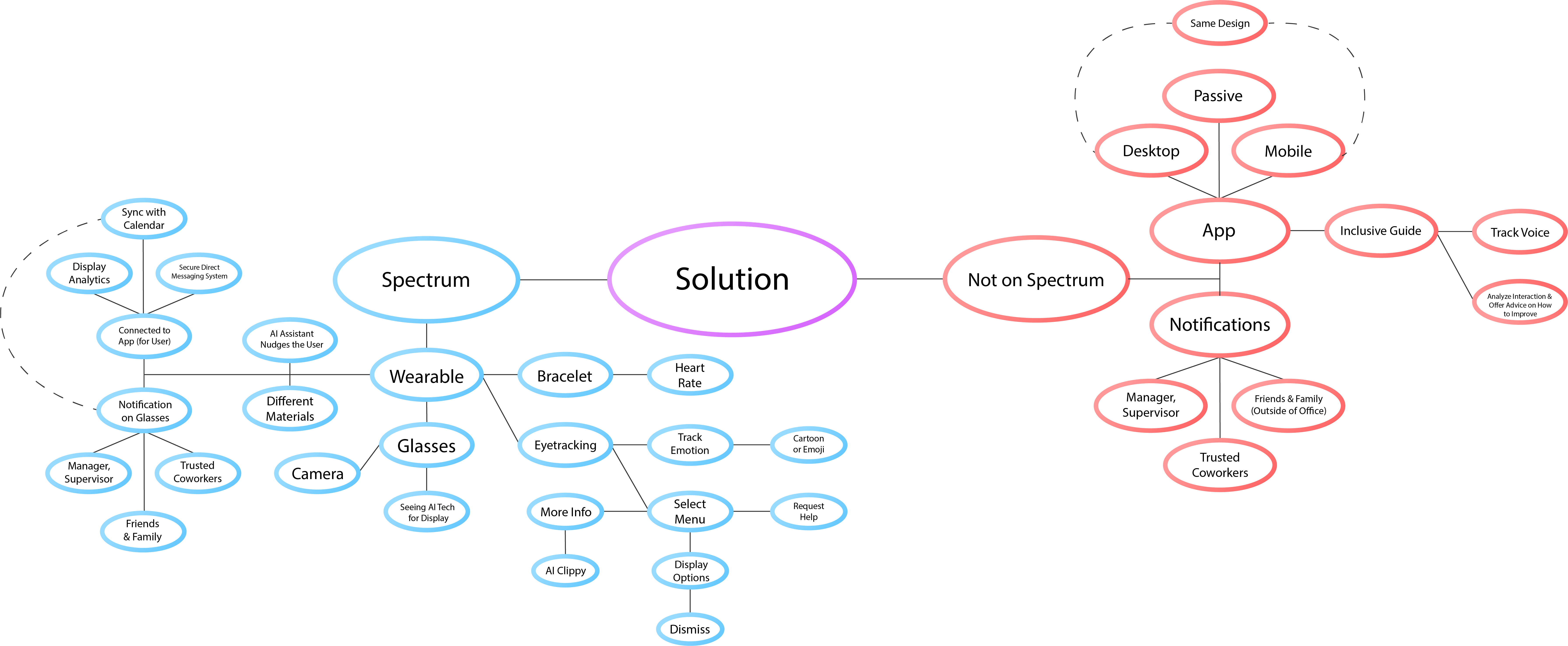
Once we figured out the user base, we started brainstorming ideas for a solution. From our research, we saw that people with ASD struggle in social situations, and so we wanted to create an assistant that helps them in conversation, and we wanted to incorporate Microsoft's Seeing AI app to help us do this. When brainstorming the form of the solution, we chose to use a wearable, specifically smart glasses, because we wanted to incorporate facial recognition to help with recognizing emotions during a conversation. We also brainstormed a few features that could be used in our solution: a notification system, an integrated app and bracelet, and a heads-up system.
Initial Solution and Testing
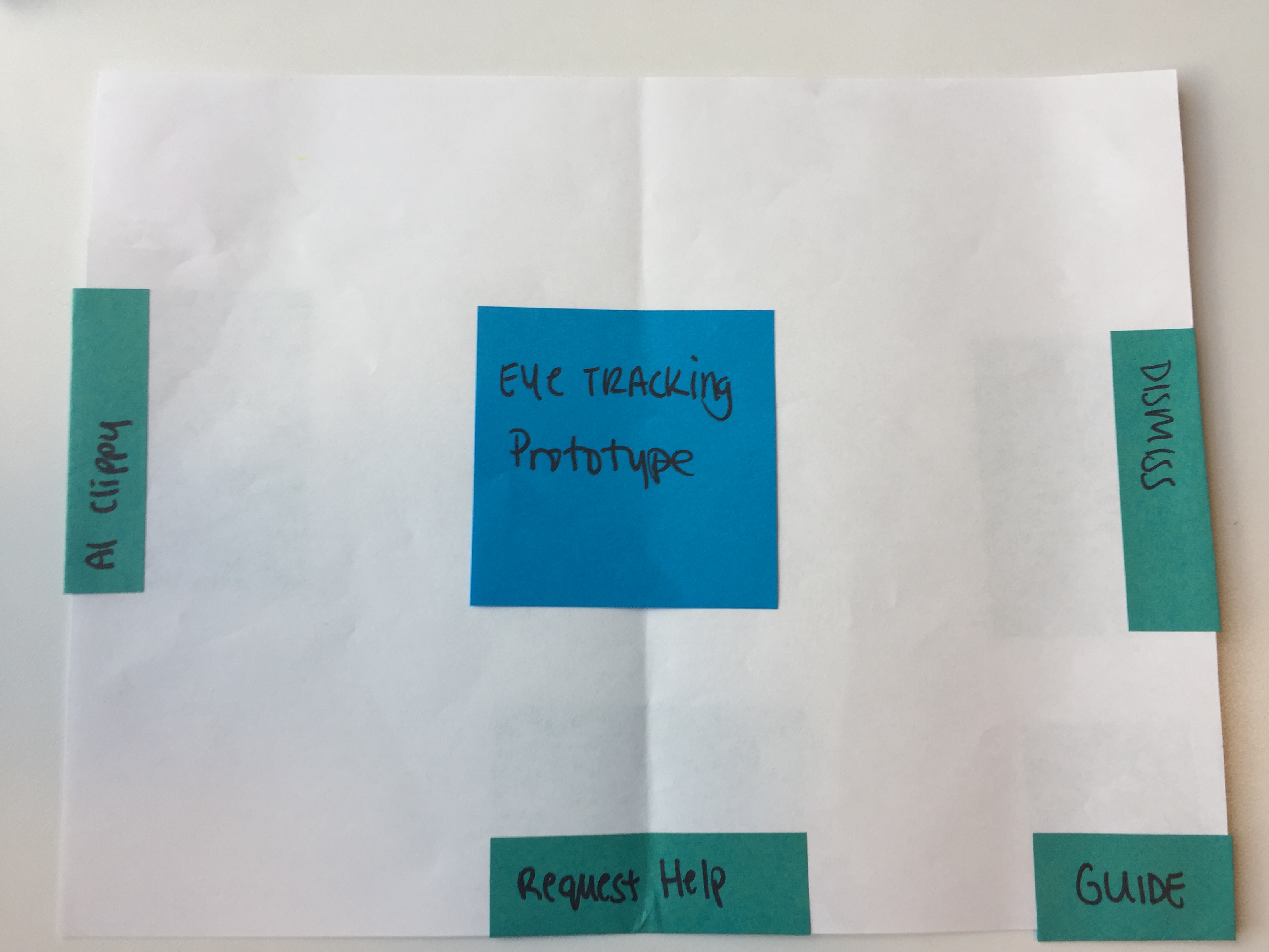
Our first solution was a paper prototype of the menu on the smart glasses. We decided that we wanted to first test the usability of the solution before creating a higher fidelity prototype. This solution included some of the features that we wanted to have, and we took it to Beth Rosenberg from Tech Kids Unlimited, as she works with teens who have ASD. From this first round of user testing, we learned that our solution was not very usable for our target demographic. It was too obtrusive and intrusive, and was not really helping with the basic issues that people with ASD have. We learned that we need do some more user research and interviews, and try for a simpler, less intrusive solution that doesn't attempt to solve to much at once.
Brainstorming Pt.2
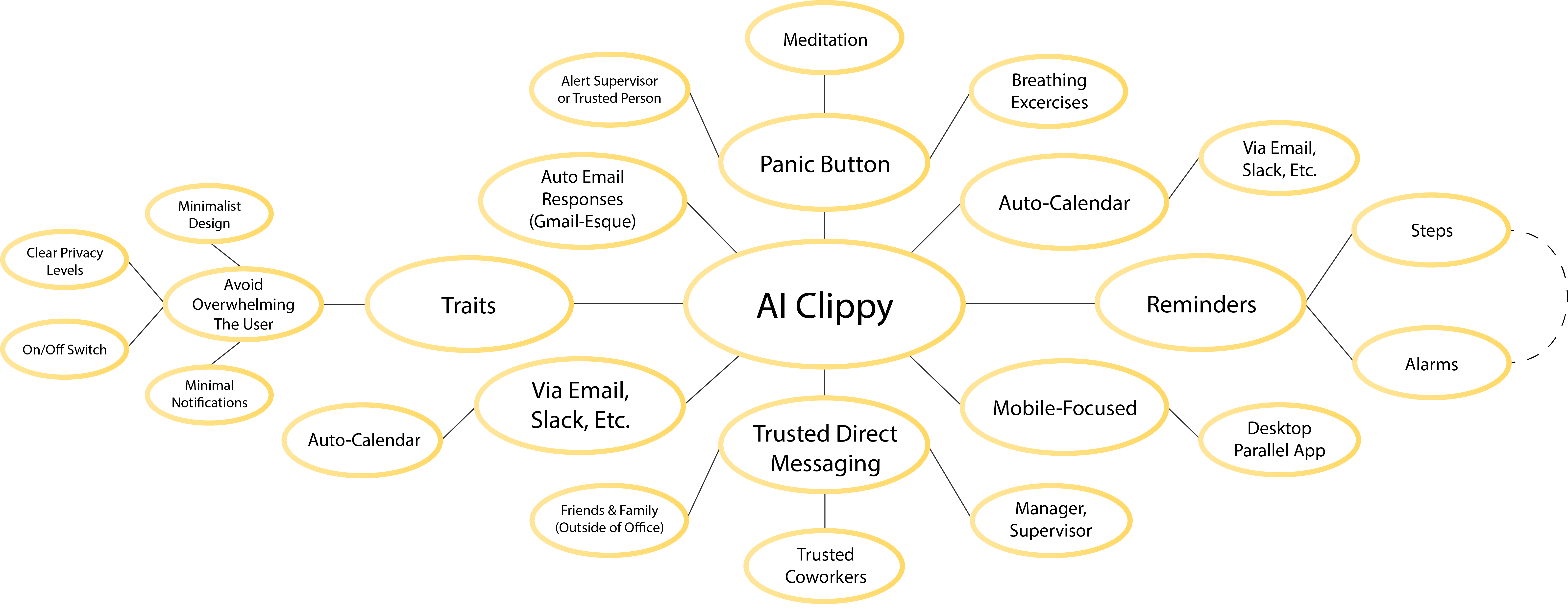
Taking the feedback that we received from our user testing, we decided to create a simpler solution in the form of a mobile app. We still wanted to tackle the social aspect of ASD, so we started thinking of how this app could be used as a tool for helping out during conversations and social interactions. Some of the ideas that we were thinking about were: having reminders about proper etiquette, having conversation pointers, and helping out with communicating with coworkers. From our original glasses prototype, we still wanted to keep the AI assistant aspect. To incorporate this, we decided to have the assistant help out in drafting emails, asking for help in the workplace, and helping the users start and maintain conversations.
As we continued to brainstorm, we decided to expand the app to keep track of current job applications, assist users with consolidating their assets (résumé, portfolio, cover letter), and providing additional resources, like trending jobs and news articles. All these features were created as a response to either our own struggles when applying for jobs, or problems that came up in user research.
Comparative Analysis
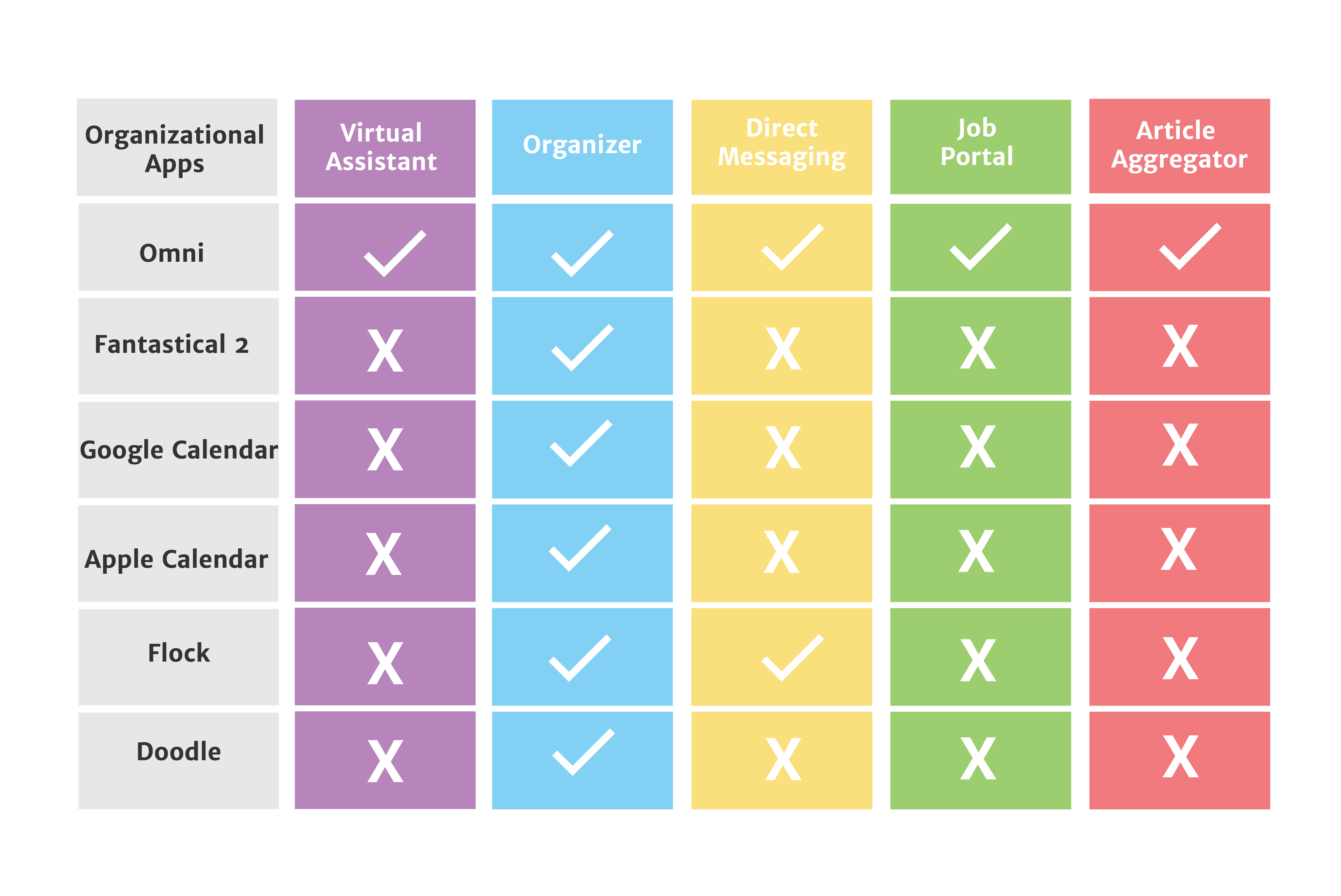
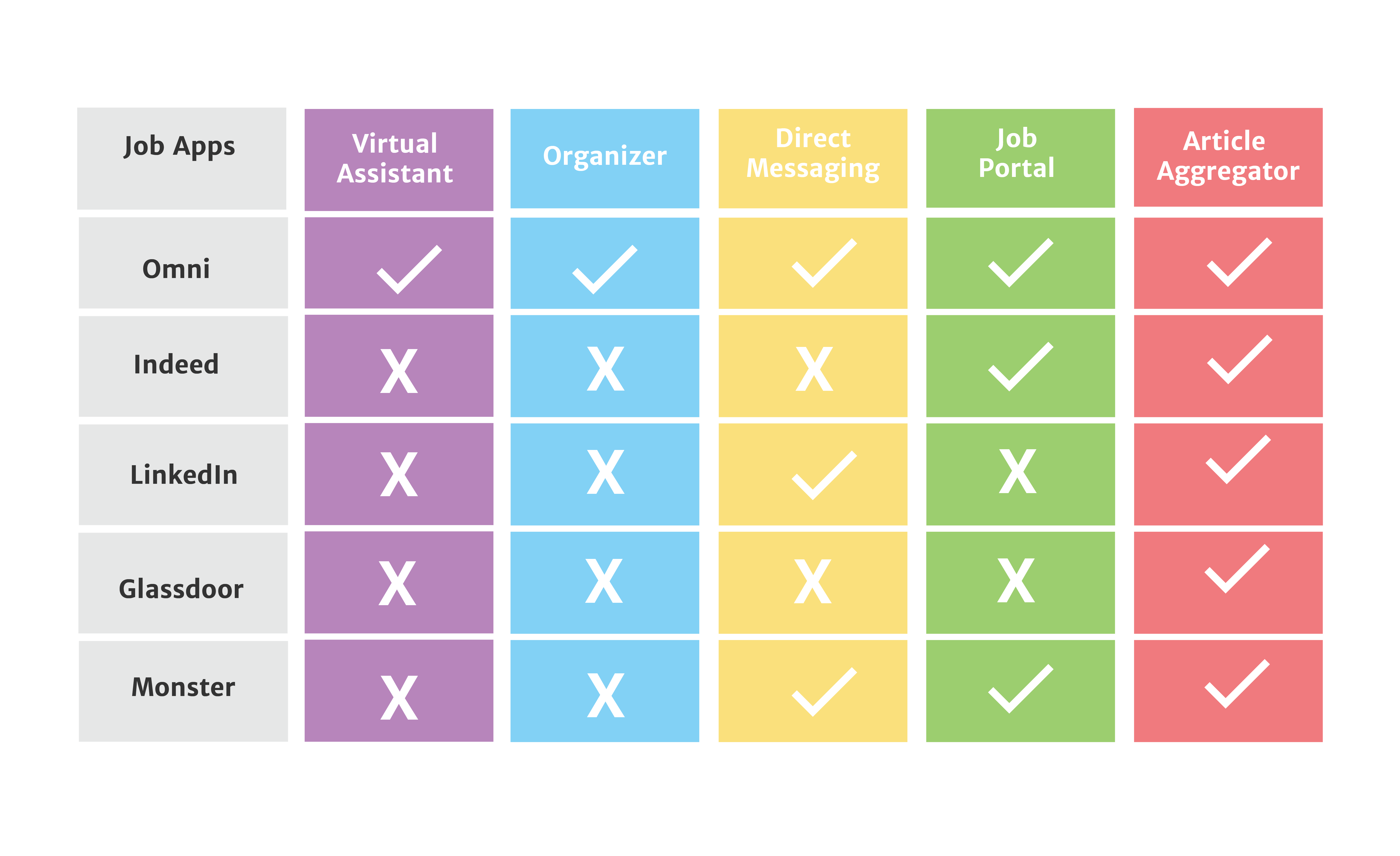
In comparison to other organizational apps, Omni is the only one that incorporates a virtual assistant, an event organizer, direct messaging, a job finder/ filter, and an article aggregator. Other apps have some of these features, but not all. In addition, we also compared our Omni app to four job finding apps, and Omni is the only app to incorporate a virtual assistant, an event organizer, direct messaging, and viewing and editing resumes and portfolios. Omni also includes a way to organize schedules and has a virtual assistant to help out when a user is confused.
User Personas/Flows
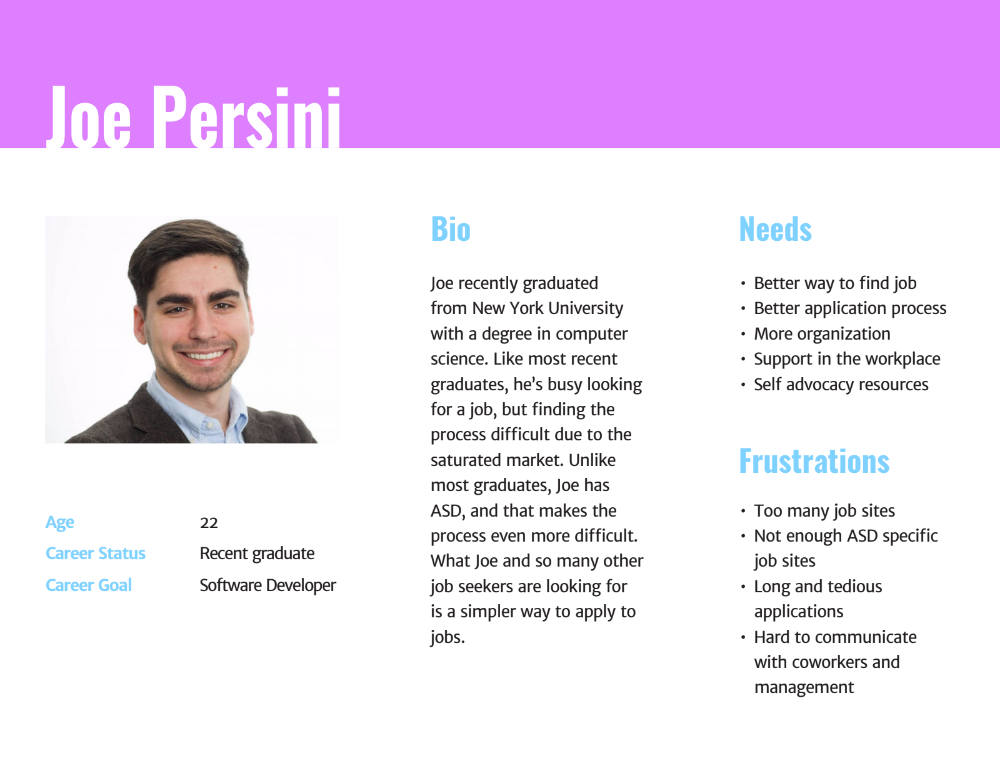
Although we created a persona spectrum previously, we decided to create one specific user persona in order to map out the user's journey. When creating this persona, we wanted to really focus in on the target demographic for the app and so Joe Persini is a twenty-two year old man with ASD looking for his first job. The needs and frustrations of this user reflect the needs and frustrations that we saw during user interviews. By creating a specific user persona, we were really able to ensure that we were on the right track when working on the app.
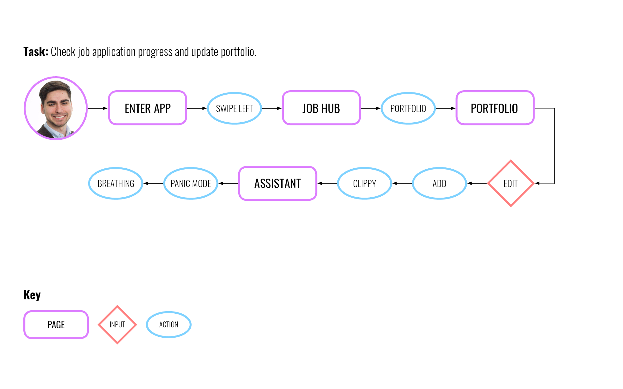
Once we had a user persona, we decided to create a few tasks for this user, and map out his journey when doing those tasks. This particular user journey reflects Joe's need for a better application process, and how our app handles that. The point of doing this user journey was to see if the app was not convoluted and confusing, and to show how a user might be helped by the AI Assistant. Creating user journeys helped us remove unnecessary features from the app.
Second Solution
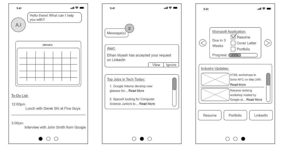
Our second prototype was a simple version of the app idea that we came up with during brainstorming. In this version, we incorporated the key features: calendar, messaging, AI assistant, and the job hub. Although this version was very barebones, it was the result of our brainstorming sessions, and it was ready to be tested with users.
User Testing Pt.2
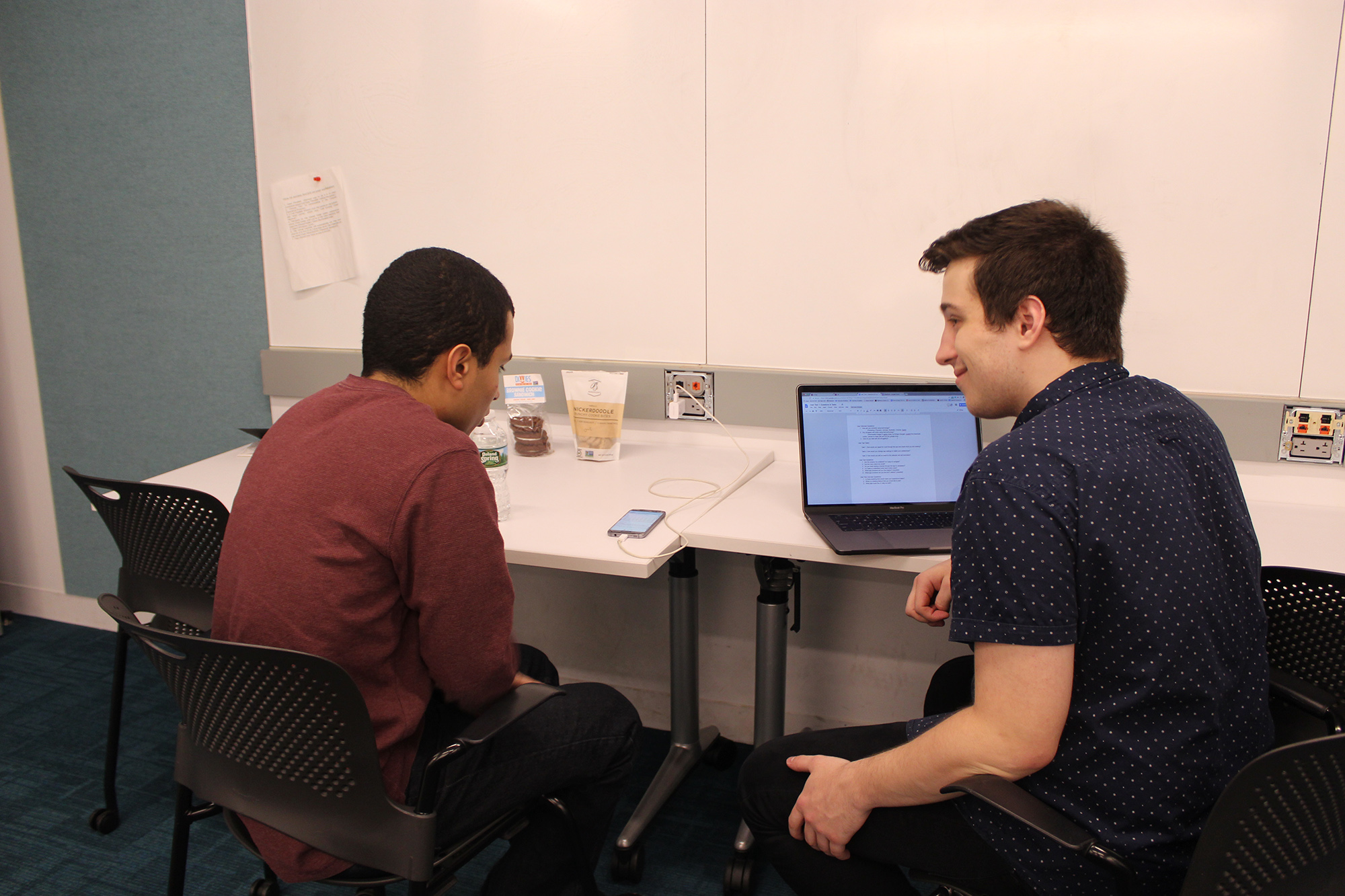
We decided to contact the students from Tech Kids Unlimited for user testing. We managed to get three users to test our app. The feedback we received was mostly positive, and reinforced the fact that we were moving in the right direction. Although the users were happy with the features of the app, we did receive feedback for a few tweaks that we could make:
- Make tutorial skippable.
- Change sizing of icons and buttons.
- Remove language like "Machine Learning".
- Add more LinkedIn integration.
- Add theming and customization.
This feedback was used in order to change the prototype, and make it better for the next round of user testing.
Third Solution
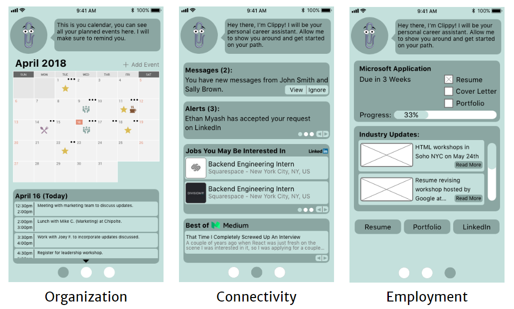
Our third prototype incorporated feedback we received from user testing, as well as the iteration and fine tuning that we were continually doing.
User Testing Pt.3
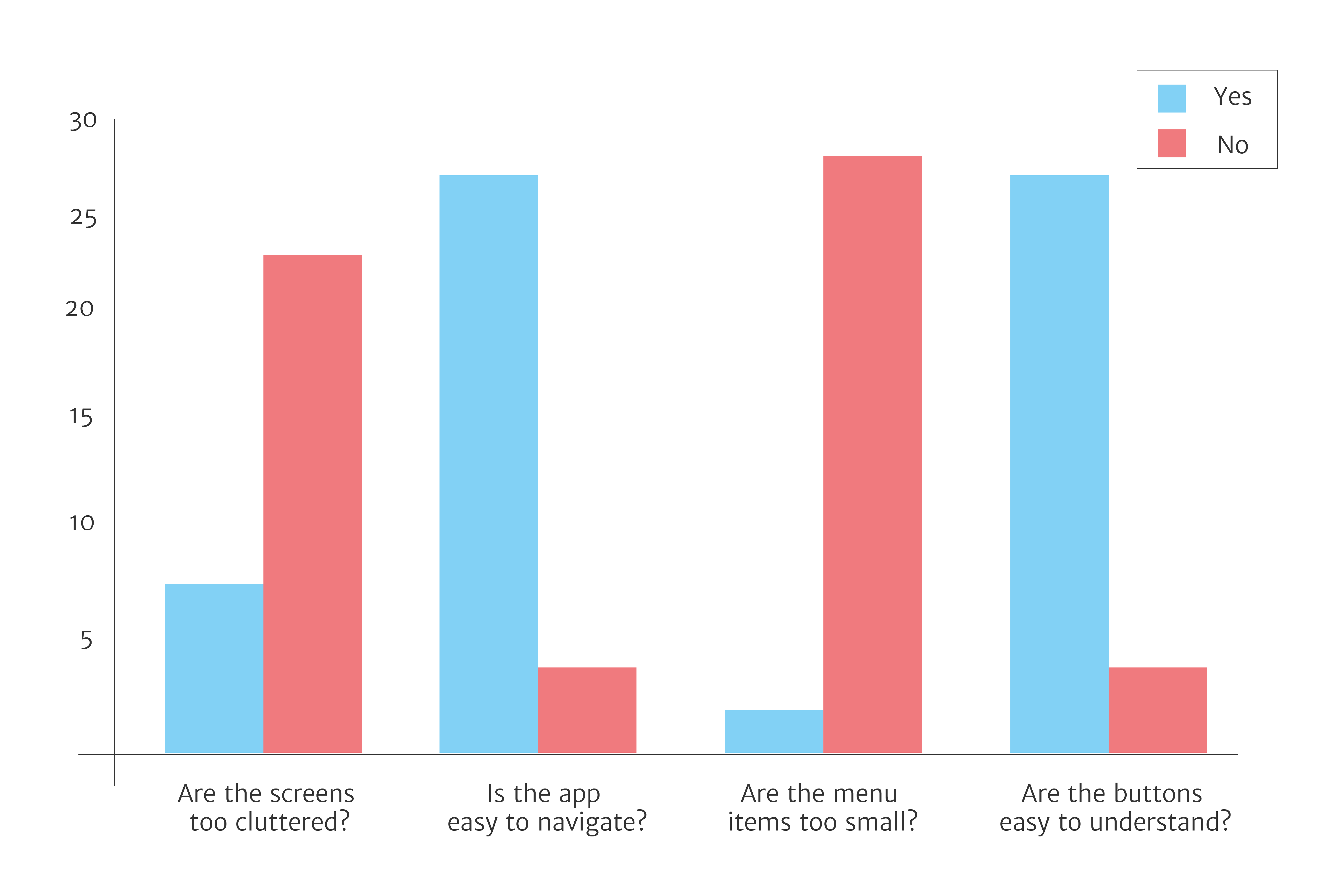
Since the third prototype was closer to the final version of the app, we decided to test it on a variety of people to get different perspectives on using this app. Everyone who tested the app had to to a few tasks, as well as fill out a survey at the end. The majority of the people thought the app was easy to use and navigate, and that they could complete the tasks given without problems. Nonetheless, we did receive constructive feedback:
- More customizability.
- Differentiate between messages and alerts.
- Check up on user more.
- Make AI Assistant less prevalent.
- Add more social media integration.
Due to the fact that this was the final prototype that we were presenting, only a few of these changes were made, while other changes were saved for later. For example, we split the alerts and messages into two separate areas, as well as added a heart rate checker inside the "Panic Mode" feature. We also allocated less real estate on the screen to the AI Assistant, and it only acts if the user asks it for assistance. We did not add more social media integration or customizability, but those features could be revisited in the future.
Group members: Nick Zimmerman, Stephanie Cen, Carissa Phong, Jason Jiang, Eric Modzelewski
Class: User Experience Design
Professor: Dana Karwas